Printed materials — bulletins, programs, handouts, study guides, prayer cards, newsletters, visitor materials, and signs — play a major role in how people access information in a church. When print materials are difficult to read, cluttered, visually overwhelming, or not available in alternative formats, disabled people may struggle to participate fully.
Accessible print design communicates welcome, clarity, and dignity. Thoughtful print materials benefit not only disabled congregants, but children, older adults, English-language learners, and anyone who prefers clear and readable information.
Why Accessible Print Materials Matter
Print accessibility is more than a design preference — it is an inclusion practice that ensures everyone can understand, follow, and participate. Many people have print-related access needs, including:
- Low vision or blindness
- Dyslexia or print-processing differences
- ADHD, autism, or cognitive disabilities
- Age-related vision changes
- Language or literacy barriers
- Sensory sensitivities to visual clutter
Accessible print materials increase comprehension, reduce stress, and strengthen belonging.
Readable, High-Contrast Text
Many print materials fail because text is too small, low-contrast, decorative, or crowded.
Key practices for readable text:
- Ensure strong contrast (black text on white or off-white background)
- Avoid placing text over images, patterns, gradients, or colored backgrounds
- Maintain consistent spacing between lines (1.2–1.5 line spacing)
- Use bold for emphasis instead of italics or ALL CAPS
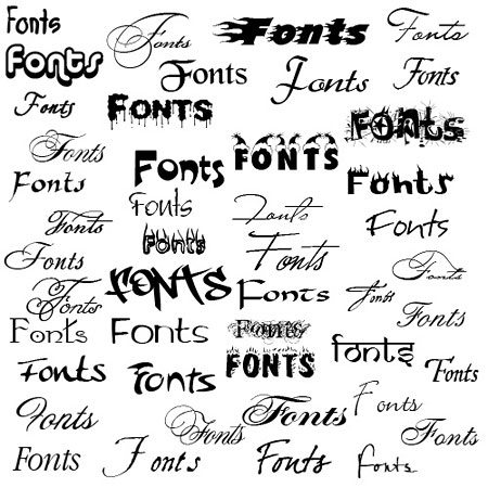
Fonts
- Style:
- Sans-Serif Typeface
(ex: Apos, Arial, Calibri, Helvetica) - Do not italicize
- Underline only used for links, not for styling
- Sans-Serif Typeface
- Size:
- Guidelines recommendations vary between a minimum of 16-18 pt. font
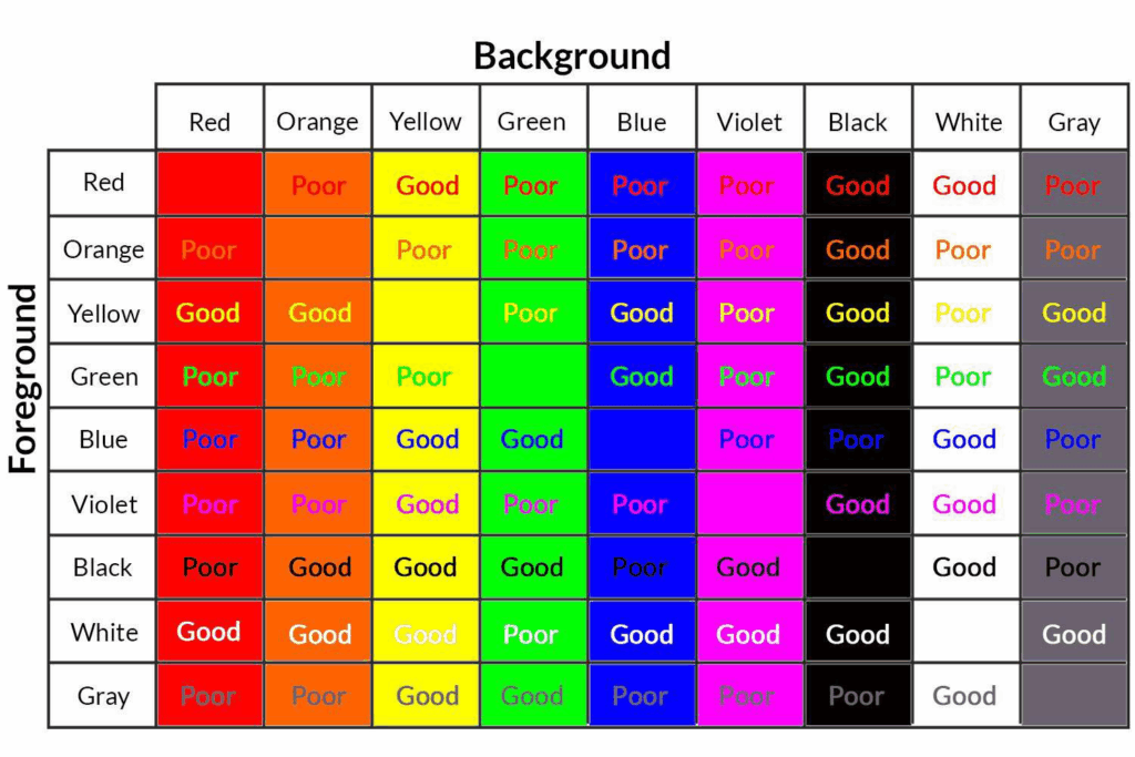
Color Use/Contrast
- Contrast: Difference in brightness between text and its background. Contrat is measured as a ratio.
- Contrast Ratio Minimum| 4.5:1
- Do not use color-heavy backgrounds behind large blocks of text, as it can cause visual fatigue and reduce readability
- Color Use:
- Use color to enhance meaning; do not convey meaning solely by color
- Use a simple and consistent palette
- Use color to organize items
- Examples: headings are blue, action items are green, and themes sorted by color
- Use color to highlight important information
Tips:
- Preview materials in grayscale to confirm readability
- Use a contrast tracker to verify that minimum guideline standards are met
Clear text benefits everyone — including people reading quickly or in dimly lit spaces.
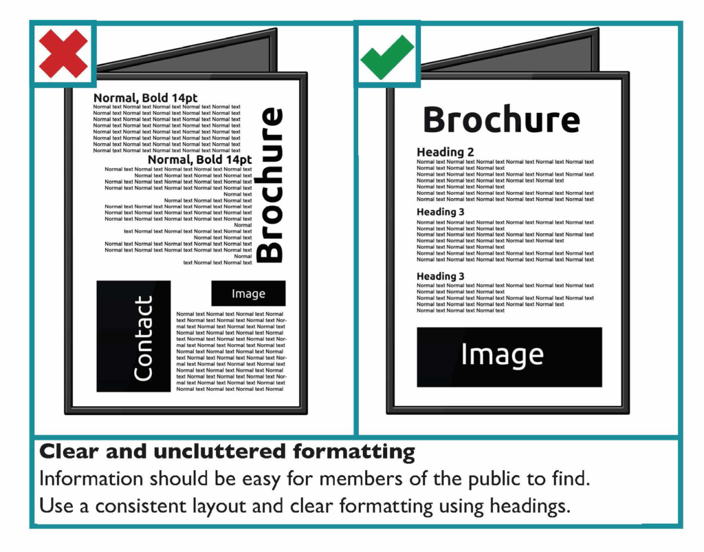
Layout & Structure That Supports Understanding
The way information is organized on a page affects how readable and accessible it is.
Helpful layout practices include:
- Ample white space to prevent visual overwhelm
- Short paragraphs and clear section breaks
- Bullet points for key information
- Left-aligned text rather than centered or justified blocks
- Consistent heading levels with clear hierarchy
- Avoiding clutter such as borders, icons, and decorative fonts
To Do
Start with a clear hierarchy and structure
Use consistent formatting throughout
Keep sections short and readable
Use white space effectively. Helps with visual processing
Use descriptive titles and section labels
Avoid

Do not overload pages with dense text
Do not use color as the only organizational cue
Do not center large blocks of text
Centering reduces readability. Left-justify most text.
Do not overload pages with dense text
Good layout makes content easier to follow for people with cognitive, attention, or sensory access needs.
Plain Language & Clear Communication
Plain language is the use of clear, simple words that everyone can understand quickly and easily.
Plain-language practices:
- Use everyday language whenever possible
- Explain theological or institutional terms
- Break complex ideas into smaller steps
- Use direct, concise sentences
- Avoid metaphors that may confuse or mislead
- Provide examples to clarify concepts
Who Benefits?
- Disabled readers
Anyone with cognitive disabilities, learning disabilities like dyslexia, ADHD, intellectual or developmental disabilities, or brain injuries can access information more easily when wording is clear and uncluttered. - People with sensory or processing fatigue
Chronic illness, pain, migraines, low energy, or post-COVID cognitive effects can make complex text much harder to follow. Plain language reduces that burden. - People with limited English proficiency
Clear structure, familiar words, and concise sentences help multilingual readers understand essential information without confusion. - Older adults
Age-related changes in vision, memory, and processing speed can make dense or jargon-heavy writing difficult. - Newcomers to a topic or system
Whether it’s legal instructions, medical information, church materials, or workplace policies, plain language helps people who haven’t been exposed to the terminology yet.
Alternative Formats
Not everyone accesses printed information in the same way. Offering multiple formats increases participation.
Accessible alternatives include:
- Large-print versions (18–22 pt font)
- Plain-language versions of complex documents
- Audio recordings of materials or sermons
- Digital versions accessible with screen readers
- Braille or tactile materials (when possible)
- QR codes linking to accessible digital copies
Offering options communicates flexibility and respect for autonomy.

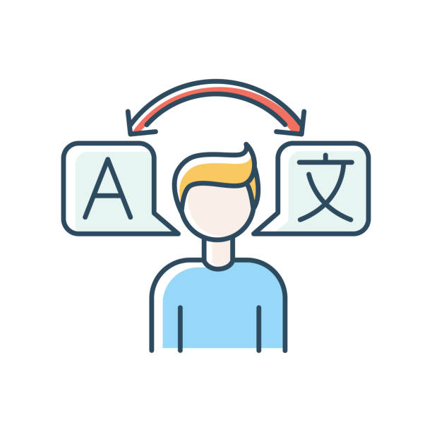
Accessible Print for Multilingual Communities
Language is an important access barrier. Churches should consider how printed materials serve members and visitors who speak different languages or rely on translation.
Support language accessibility by:
- Providing translations of worship materials when possible
- Using bilingual or simplified English versions of printed items
- Avoiding idioms and culturally specific phrases that can confuse readers
- Using visuals, icons, or diagrams to support communication
- Clearly labeling translated materials and how to request them
Accessible language practices expand welcome across cultures and backgrounds.
Sensory Considerations in Print Materials
Print materials can overwhelm readers through visual clutter, glossy finishes, or distracting layouts.
To reduce sensory overload:
- Use matte paper instead of glossy finishes to prevent glare
- Limit the number of fonts and sizes used on a page
- Avoid bright or neon colors
- Use consistent, predictable layouts week to week
- Keep ornamentation minimal (borders, flourishes, shadows)
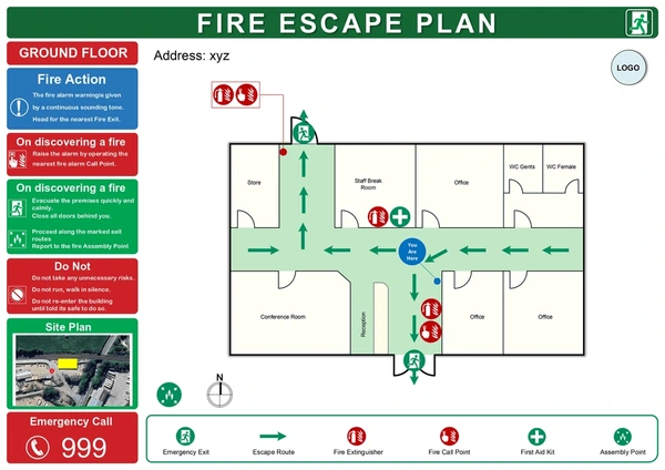
Visuals & Symbol Supported Text
Simple design is often the most accessible design.
- Pair announcements or instructions with simple icons for clarity.
- Use pictograms or symbol-supported text for safety or procedural information (evacuation, nursery check-in).
- Choose images that support understanding rather than decoration.
Real-Life Scenarios
Scenario 1: Only small-print bulletins are available
Problem: People with low vision or aging adults cannot follow the service.
Better practice: Offer large-print bulletins, digital formats, and accessible layout.
Scenario 2: Announcements are long, dense, and text-heavy
Problem: Readers with cognitive or attention disabilities struggle to process information.
Better practice: Break content into bullet points, headings, and clear sections.
Scenario 3: Worship materials include outdated or offensive terminology
Problem: Ableist language or metaphors cause harm.
Better practice: Replace problematic terms with respectful language and review wording regularly.
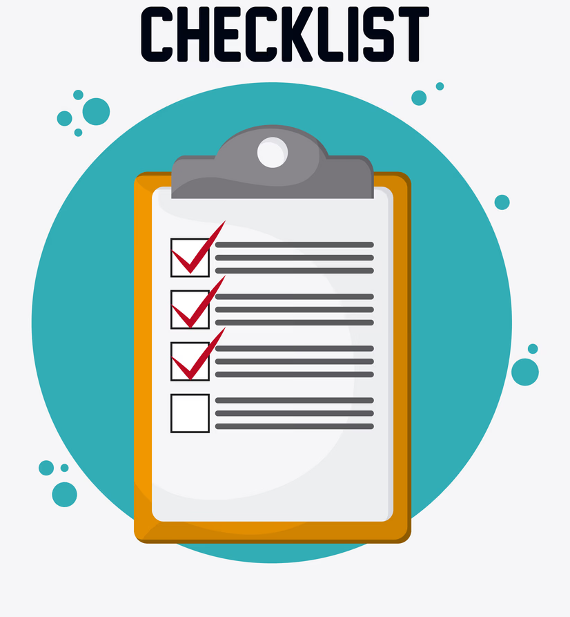
Quick Checklist:
Accessible Print Materials
- Text is readable, high-contrast, and large enough for easy reading.
- Layouts provide white space, clear structure, and plain-language sections.
- Materials are available in large print, digital, and alternative formats.
- Language avoids jargon, metaphors, and confusing phrasing.
- Materials reflect respectful and disability-inclusive language.
- Visual design supports sensory comfort and reduces cognitive load.
- Multilingual needs are considered and supported through translation.
Resources & Further Support
- Digital.gov
Accessibility for Visual Designers - APH (American Printing House for the Blind)
Large Print Guidelines - Plain Truth Project
Resource Database
Thoughtful print design communicates welcome, clarity, and hospitality. Accessible materials make it easier for everyone to participate in worship, learning, and community life — and reflect a commitment to dignity and belonging for all people.