Clear, consistent signage is one of the simplest and most powerful ways a church can support access and belonging. When signs are easy to see, understand, and follow, people can navigate the building independently and with confidence. Good wayfinding reduces anxiety, prevents confusion, and supports disabled people, visitors, children, elders, and anyone unfamiliar with the space.
This page offers practical guidance for designing signage and wayfinding systems that are readable, intuitive, and welcoming for all.
Why Signage & Wayfinding Matter
Knowing where to go — and being able to get there safely — is a fundamental part of access. Poor signage can create anxiety, physical strain, or disorientation, especially for people with:
- Low vision or fluctuating vision
- Mobility disabilities that make unnecessary walking painful
- Neurodivergent processing needs
- Anxiety or wayfinding challenges
- Memory or cognitive disabilities
- Hearing differences that limit ability to ask for directions verbally
Good wayfinding reduces cognitive load and provides predictable, consistent cues throughout the building.
Principles of Accessible Signage
Accessibility is achieved through clarity, consistency, and ease of use. These principles apply to permanent signage, temporary signs, maps, directional arrows, and digital displays.
- Clear: Easy to read at a glance
- Consistent: Same fonts, colors, and icon styles across the building
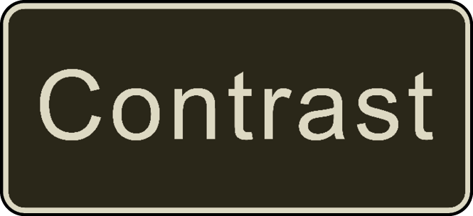
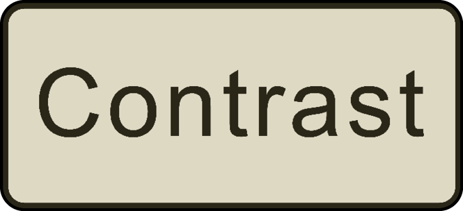
- High-contrast: Minimum 70% contrast ratio between text and background
- Predictable: Signs appear where people expect them
- Multimodal: Visual, tactile, and written cues support diverse needs
- Uncluttered: Simple messaging without decorative or confusing elements
Signage should support independence, not require guesswork or repeated questions.
Readability & Design Standards
Best practices for readable, accessible signs:
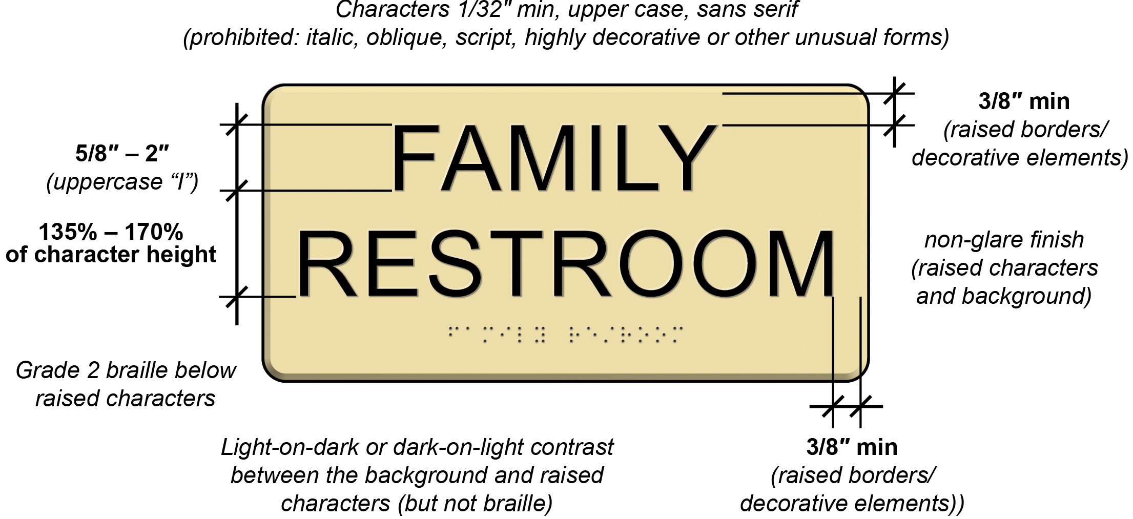
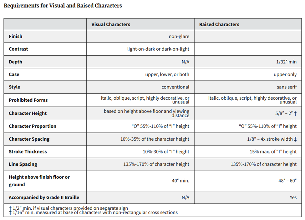
- Sans-serif, non-decorative fonts (ADA 703.5 guidelines)
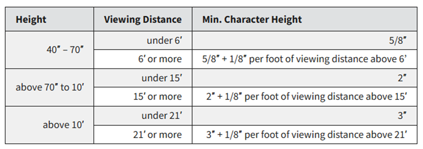
- Large text size: At least 5/8 inch for room identification signs
- High-contrast colors: Dark text on light background or vice versa
- Matte finish: Avoids glare and reflections
- Simple icons: Use recognizable symbol sets (e.g., restroom icon, elevator icon)
- Avoid ALL CAPS for long text; use sentence or title case for readability
- Consistent placement: Maintain a standard height and location across the building
The goal is signage that can be read from a distance, recognized instantly, and understood quickly.
Placement, Height, & Location
Where signs are placed is just as important as how they look.
Placement guidelines:
- Mount signs between 40 and 70 inches high to be visible for seated and standing people
- Place directional signs at decision points: hallway intersections, stairwells, elevators, entrances
- Ensure signs are not behind furniture or above door frames out of sightlines
- Use arrows consistently following the same direction convention
- Avoid placing signs on glossy or patterned walls that reduce visibility
If someone unfamiliar with the building can navigate easily, you’ve done it well.
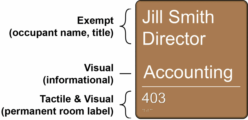
Tactile, Braille, & Multisensory Signage
Braille and tactile lettering increases access for blind and low-vision congregants and visitors.
Consider including:
- Braille on permanent room identification signs (restrooms, offices, fellowship hall)
- Raised tactile letters for easy reading by touch
- Simple raised icons (restroom, stairs, elevator)
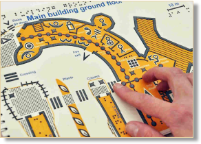
- Tactile maps near main entrances and elevators
Tactile signage also benefits people with limited vision due to lighting glare or aging.
Maps, Directories, & Orientation Tools
Maps and directional tools help people understand how the building fits together.
Accessible map practices include:
- Large-print maps near main entrances
- Tactile maps for key areas (when possible)
- Simple building layouts showing restrooms, sanctuary, offices, elevators, classrooms
- Digital versions available on your website for advance planning
- Event-specific maps for conferences, holiday programs, or community meals


Maps reduce anxiety for first-time visitors and people with wayfinding or mobility challenges.
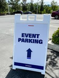
Temporary & Event Signage
Temporary signs must also be accessible — especially for large events, holidays, and programs.
- Place temporary signs at accessible heights (not taped high on walls)
- Avoid blocking walkways or placing signs where cane users might hit them
- Use large, high-contrast fonts just like permanent signs
- Include arrows and simple instructions
- Ensure signs do not lean or shift during the day
Temporary signs should match the clarity and predictability of your permanent wayfinding system.
Real-Life Scenarios
Scenario 1: Missing signs create confusion
Problem: Guests can’t locate restrooms without asking multiple people.
Better practice: Add clear, high-contrast signs at intersections, entrances, and lobby areas.
Scenario 2: Glossy signs cause glare
Problem: Shine on signage makes text unreadable for people with low vision.
Better practice: Use matte finishes and non-reflective materials.
Scenario 3: Directional arrows are inconsistent
Problem: Arrows point in unclear directions, causing frustration.
Better practice: Use a consistent arrow orientation across the building.
Scenario 4: Temporary event signs block mobility access
Problem: A-frame signs sit in the middle of hallways.
Better practice: Place signs at the edges of walkways and maintain wide routes.
Quick Checklist:
Signage & Wayfinding
- Signs are consistent in style, font, and layout throughout the building.
- High-contrast text and simple sans-serif fonts are used.
- Signs are mounted between 40 and 70 inches high.
- Matte finishes prevent glare and reflections.
- Braille and tactile letters are included on key signs.
- Directional signs appear at hallway intersections and decision points.
- Large-print or tactile maps are available near entrances and elevators.
- Temporary signs are accessible, stable, and placed without blocking walkways.
- Signage is predictable, clear, and easy to follow for all visitors.
Resources & Further Guidance
- ADA Accessibility Standards
U.S. Access Board-Chapter 7: Signs - Opportunities for Ohioans with Disabilities-Accessible Ohio
Wayfinding Guide - Innovative Solutions for Universal Design
Circulation 3.1 Wayfinding
Accessible signage and wayfinding allow people to move with confidence, independence, and dignity. When churches invest in these features, they communicate welcome before a single word is spoken.